Method-1
You should follow method 1 if you want a beautiful toc for your page.I’ve tried to write here shortly and clearly. follow this instruction step by step and I think It will work.
HTML
The HTML code of a post has different elements like top headers, titles, pictures, and so on. But we just focus only on the content area to divide it into text article and ToC nav .In the singl.html file of my Hugo website, I wrap my old content in a new div and add a new nav section for ToC as below
<div class="article-nav" id="article-nav-id">
    <article class="overlay-top">
        {{ .Content }}
    </article>
    <nav class="hide-on-mobile section-nav">
        <h3 class="ml-1">Table of contents</h3>
        {{ .TableOfContents }}
    </nav>
</div>
CSS
I only explain the important CSS parts. To hide the ToC on small screens, I add a media query
@media screen and (max-width: 1024px) {
  .hide-on-mobile {
      display: none !important;
  }
}
To style container of article and nav, I use a grid so the left-hand side is the article and the right-hand side is the ToC.
@media only screen and (min-width: 1025px) {
  .article-nav {
    display: grid;
    grid-template-columns: 1fr 15em;
    max-width: 100em;
    width: 90%;
    margin: 0 auto;
  }
}
sticky position is very important to have a fixed in place ToC:
nav {
  position: sticky;
  top: 2rem;
  align-self: start;
}
When a ToC item is marked as active using JavaScript it will be like:
.section-nav li.active > a {
  color:purple;
  font-weight: 600;
}
The nav section (ToC) is styled like below
.section-nav {
  font-size: smaller;
  padding-left: 0;
  border-left: 2px solid #efefef;
}
The links of nav are formatted as below, transition settings make navigation smooth.
.section-nav a {
  text-decoration: none;
  display: block;
  padding: .125rem 0;
  color: #ccc;
  transition: all 50ms ease-in-out;
}
Some styling CSS for nav
.section-nav a:hover,
.section-nav a:focus {
  color: #666;
  font-weight: 600;
}

nav > ul, ol {
  list-style: none;
  margin: 1rem;
  padding: 0;
}
JavaScript
Add the below codes somewhere in single.html before the last {{\end}} line. It finds the current section on the screen, and assign class active to its corresponding nav item, and clears it when the section goes out of view.
<script>
	window.addEventListener('DOMContentLoaded', () => {
		const observerForTableOfContentActiveState = new IntersectionObserver(entries => {
			entries.forEach(entry => {
				const id = entry.target.getAttribute('id');

				if (entry.intersectionRatio > 0) {
					clearActiveStatesInTableOfContents();
					document.querySelector(`nav li a[href="#${id}"]`).parentElement.classList.add('active');
				}
			});
		});
		document.querySelectorAll('h1[id],h2[id],h3[id],h4[id]').forEach((section) => {
			observerForTableOfContentActiveState.observe(section);
		});

	});

	function clearActiveStatesInTableOfContents() {
		document.querySelectorAll('nav li').forEach((section) => {
			section.classList.remove('active');
		});
	}
</script>
Method-2(Easy)
This method is very easy.you can try it if you don’t understand method-1.
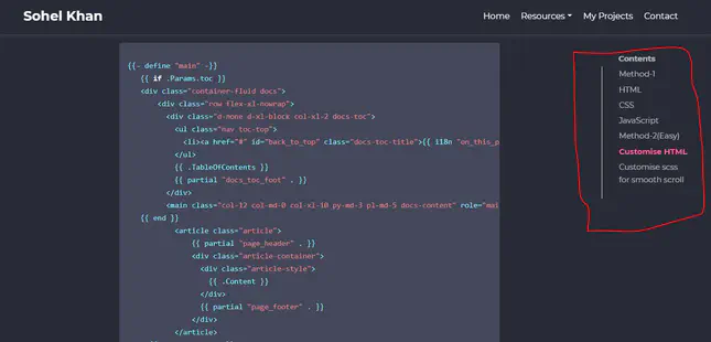
Customise HTML
copy this code and customise your root layouts (not theme layouts) layout/_default/single.html.
 {{- define "main" -}}
    {{ if .Params.toc }}
    <div class="container-fluid docs">
        <div class="row flex-xl-nowrap">
          <div class="d-none d-xl-block col-xl-2 docs-toc">
            <ul class="nav toc-top">
              <li><a href="#" id="back_to_top" class="docs-toc-title">{{ i18n "on_this_page"     }}</a></li>
            </ul>
            {{ .TableOfContents }}
            {{ partial "docs_toc_foot" . }}
          </div>
          <main class="col-12 col-md-0 col-xl-10 py-md-3 pl-md-5 docs-content" role="main">
    {{ end }}
            <article class="article">
                {{ partial "page_header" . }}
                <div class="article-container">
                  <div class="article-style">
                    {{ .Content }}
                  </div>
                  {{ partial "page_footer" . }}
                </div>
            </article>
      {{ if .Params.toc }}
          </main>
        </div>
      </div>
      {{ end }}
    {{- end -}}
Customise scss for smooth scroll
To enable smooth scrolling is really easy, it you can enable it using a single line of SCSS:
   html {
       scroll-behavior: smooth;
   }